
by Myrna Kooij
How can we communicate science through illustrations? During his workshop ‘Visual Storytelling for Science Communication’ on October 9th, alumnus Mark Hektor taught me to draw a sheep and introduced me to the world of storytelling. Read more about Mark’s illustrating experience and learn about his main take-away message to get your point across when telling a visual story.
Art draws people’s attention better than plain text.
Mark Hektor is an alumnus of the Science Education and Communication (SEC) master’s programme at the University of Groningen (UG). Since his graduation, he has already gained quite some experience in the field as an illustrator and science communicator.
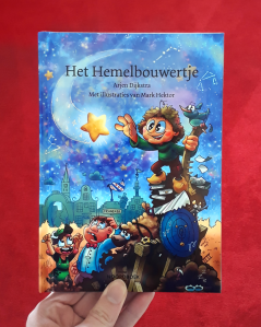
For example, he visualised the story of Eise Eisinga into a children’s book ‘Het Hemelbouwertje’, together with Arjen Dijkstra, director of the Tresoar museum in Leeuwarden. Next to that, Mark designed his own comic book for the exhibition Masterminds of the University Museum, in which he captures the history of the UG in seven stories. What tips and tricks does Mark have for science communicators?
Pictures and stories are fun.
During the workshop, Mark shared some of his main tips to get your point across when telling a visual story, or in this case when designing an infographic. I’ve summarised his main points in 10 tips and tricks for you to consider when illustrating:
- 👀 Tip: Know your audience. What’s their age and profession? Is your audience familiar with the concept you’re illustrating? You can test your design with your audience.
- 🧑🦽➡️ Tip: Check the accessibility of your design. Colour contrast can make your design more appealing, but be aware: some people with colour blindness cannot see the difference between red and green. Think of this when choosing colours. For example, you can use an online Colour Contrast Checker tool.
- 🧑🏾🤝👩🏼 Tip: Add diversity. Your audience needs to be able to recognise themselves in your illustrations, so that they feel connected. For example, if you only use images of a white male (think Einstein)for a scientist, this contributes to a stereotype. When designing, think of the representation of people with different skin colours, sexes, or disabilities.
- 📖 Tip: Frame your content as a story using characters. For this, Mark advises to go watch a movie or series and pay attention to its story cycle, which is usually structured like this: The main character starts in a familiar setting. Then something happens, and the character faces a new situation. However, there is a low point. The character is faced with a choice: give up or keep going? The story usually ends in the familiar setting, but with the main character as a changed person.
- 🎨 Tip: Show, don’t tell. This might be the core message of this entire workshop. Use as few words as possible in your infographic or design. What images can you use to illustrate your story? Use examples that people can relate to. Did you notice the concrete examples I just gave you when reading these tips? And did you notice the emoticons I added before each tip?
As for the words you do use:
- ❓ Tip: Start with a question. Did you notice the question at the beginning of this article? Starting with a question helps to grab the reader’s attention, and makes them wonder about the answer – personal note when writing: also make sure to answer the question. The content of your illustration should match the reader’s expectations.
- 💬 Tip: Stick to one core message. For example, when making a PowerPoint slide, people tend to fill the whole slide with text, which leaves the audience reading the PowerPoint instead of listening to your presentation.
- ❌ Tip: Avoid jargon. Mark uses the rule: “If you say it, you have to explain it.” You can test for difficult words with a test audience or with a readability checker. For Dutch science communicators, Mark shared the website ishetb1.nl, which you can use if you want to check if a word is too complicated. It also offers alternative words that you can use as synonyms. Another tool I discovered: zoekeenvoudigewoorden.nl
- ↘️ Tip: Check the reading direction. Put the most interesting thing at the start. Most people tend to read from top left to bottom right. To practice, Mark advises looking up comic tutorials as an example.
- ✏️ Tip: Be as brave as a toddler and just start somewhere. Personally, I find this tip one of the most helpful take-home messages. Sometimes, I can get lost in the idea of how something should look and forget to just start somewhere. When that happens, I try to remember that the first effort doesn’t have to be perfect. “The first draft of anything is shit,” as was once said by Ernest Hemingway.
What illustrating programme should you use for your design? For creating infographics, Mark likes to use the ‘vector art’ programme Inkscape, in which the design can be easily adjusted and transferred without losing quality. He also recommends checking out the ‘pixel-based’ programmes Clip Studio Paint or Photoshop.
Where can you get free images? Mark emphasises that pictures are made by people who make their living out of creating them. Like Mark earns his money through his illustrating work. Therefore, you should always give the content creators credit where credit is due. For photographs without copyright, you can check out Pixabay or Pexels, which offer free images.
